
25 Redesigned Logos – Changing world of Graphic Designs!!
Monday, June 7, 2010
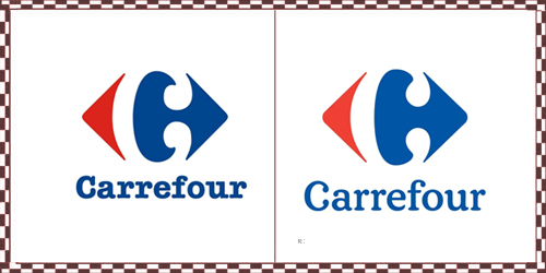
| 1 ) Carrefour: Since 1966, Carrefour, a French supermarket chain has been consistent with its C-in-a-diamond icon and bold fonts. Well, now you will see it with a new word mark and a slightly modified icon. |
 |
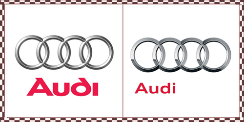
| 2 ) Audi: Audi revealed a simplified logo that gave a new shine to the four connected rings, from a matte finish to a more chromalicious one. |
 |
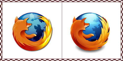
| 3 ) Firefox Logo: King of browsers “Mozilla’s Firefox” have added minimal changes to its logo – less hairy, more submerged, more defined flames. |
 |
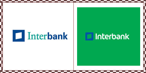
| 4 ) Inter bank With many name changes to make heads or tails of, it first became Interbanc with a “c” in 1980 and in 1996 it was changed to Interbank with a “k,” |
 |
| 5 ) MasterCard Logo: The old symmetry logos have been replaced with a trio of spheres, with the centre sphere being blurred and brown. |
 |
| 7 ) Kraft foods: With the beginning of this year Kraft foods introduced a completely new corporate identity but few months back it further modified its redesigned logo. |
 |
| 8 ) Discovery Kids With changing the letter “I” into exclamation mark and changes to“S”, it is delivering a fun loving impact |
 |
| 6 ) Vista prints: Many people balme VistPrint.com for providing cheap, fast and mediocre quality. So they think their redesign well-explain their services |
 |
| 9 ) Jack in the box: Duffy & Partners has added a new funky and lively appeal to the famous fast food chain “Jack in the box” logo. |
 |
| 10 ) Videocon: India-based Videocon, one of the largest consumer products in its country, has released its new” V” icon which has become instantly become a recognizable shape. However, the typography, looks out of date and clashes doesn’t compliments the icon. |
 |
| 11 ) Good Humor: |
 |
| 12 ) Hertz Logo: The shadow and the sloopy look of the logo has been replaced with stiff typeface, adding curve to letter "r" |
 |
| 13 ) Union bank of California: The famous California bank logo has emerged with a dominating letter “U” with its swooping feel adding strength and personality to the services of the bank. |
 |
| 14 ) SGI Logo: The typeface of Silicon Graphics, Inc was always considered weird with their hybrid rounded and flat edges. In contrast, the new logo is, simply flat without any exciting feel. |
 |
| 15 ) Playstation3: This September, PlayStation officially unveiled the latest update featuring a slimmer hardware design along with a sleek new logo. |
 |
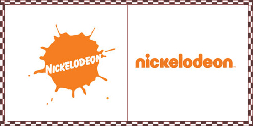
| 16 ) Nickelodeon Logo: The Nick team thought it was high time to change their 30 year old identity. So here is their new logo a plain display of Bazooka rounded letterforms in orange and white. |
 |
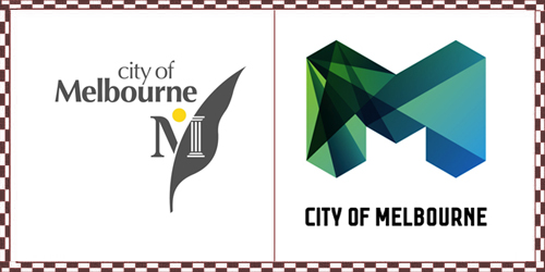
| 17 ) City of Melbourne: With their new identity that will represent the City of Melbourne, and provided plenty of rationale behind the new identity replacing a logo designed in the early 1990s. |
 |
| 18 ) Network Solutions: The pioneer of domain registration world, network solutions has come up with a prominent and loopy redesign, with the folds adding motion to the redesign. |
 |
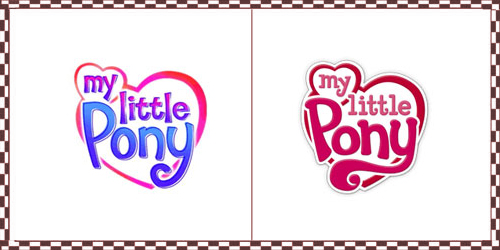
| 19 ) My little pony: The brand has kept experimenting with its design and packaging for more than 25 years but the long swaying “Y” in the latest version is irritating. |
 |
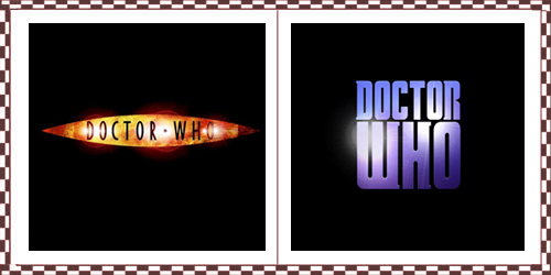
| 20 ) Doctor Who: Lately, BBC unveiled the new logo for the longest-running science fiction program, showcasing a massive DW monogram in a tightly spaced slab serif. |
 |
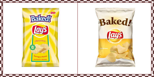
| 21 ) Lays: I know this should be called a package redesign rather than a logo redesign. However, it is giving a complete new look to the product so I thought it should be on the list too. |
 |
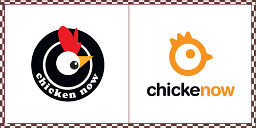
| 22 ) Chicken Now: With their recent Popeyes work, has helped them to rename and rebrand their popular (in the Southwest, at least) retail offering. And now for some Chickenow. |
 |
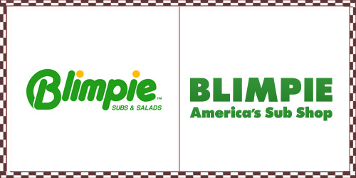
| 23 ) Blimpie Logo: Famous for its sub sandwiches, Blimpie has always used component of fun and liveliness in its logo but the new emblem is very boring and generic. |
 |
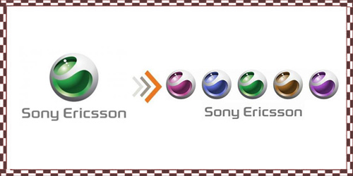
| 24 ) Sony Ericson: Well, don’t be shocked with Sony Ericson on the list because it has not changed the logo but has released its logo in some electrifying colors. |
 |
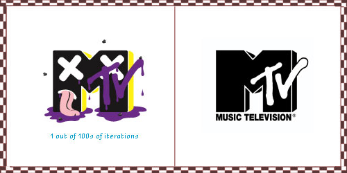
| 25 ) Mtv: Avoiding a drastic change, that it becomes hard to recognize, MTV has come up with a refreshing rebranding. The logo remains black on a white ground – no color, pattern or texture to decorate it. |
 |
| source : http://www.graphicdesignblog.org |


 Posts
Posts


0 comments:
Post a Comment